
Contents
Table of Contents
Tips for Designing Eye-Catching Instagram Posts
Instagram is arguably the most visually competitive space of all the web. Depending on whether your post catches your eye or loses track on the timeline, the scroll may only take a fraction of a second. And making the scroll stop is not just about selecting the right filter. Each color, frame, and caption influences the way people feel about your visual content.
In this guide, we provide practical Instagram content creation tips. We will cover composition, lighting, contrast, and storytelling. We will teach you to make appealing posts that will resonate with the audience and prompt community involvement.
Framing, Focus, Hierarchy
Tip 1: Keep It Simple At First Glance
Your image should make sense even at thumbnail size. Lead with one clear subject, crop decisively, and remove anything that doesn't serve the story. Straighten horizons, align verticals, and leave some negative space so your viewer’s eye knows exactly where to go.
Tip 2: Guide the Viewer's Eye
Use compositional tricks like the rule of thirds or leading lines to highlight your main element. Keep your text minimal — just a short, high-contrast headline if needed. Faces or products should always be slightly brighter than the background to hold attention naturally.
Tip 3: Keep Your Edits Subtle
Instagram tips in 2025 insist on avoiding heavy filters and unnatural edits. However, if you still want to emphasize some detail, experiment with negative space and subtle contrast boosts. A tasteful vignette will let you pull the focus inward. What is a vignette in photography? It means making the corners of a photo appear slightly darker than the center to draw attention to the main subject easily.
Tip 4: Test Before Sharing
Test your post at 10–15% zoom to mimic feed size; if the message is not obvious, simplify again. Keep one idea per image and one CTA per caption to avoid cognitive overload. Save a minimal preset for exposure/contrast only, then tweak color locally so your look stays consistent.
Light and Contrast
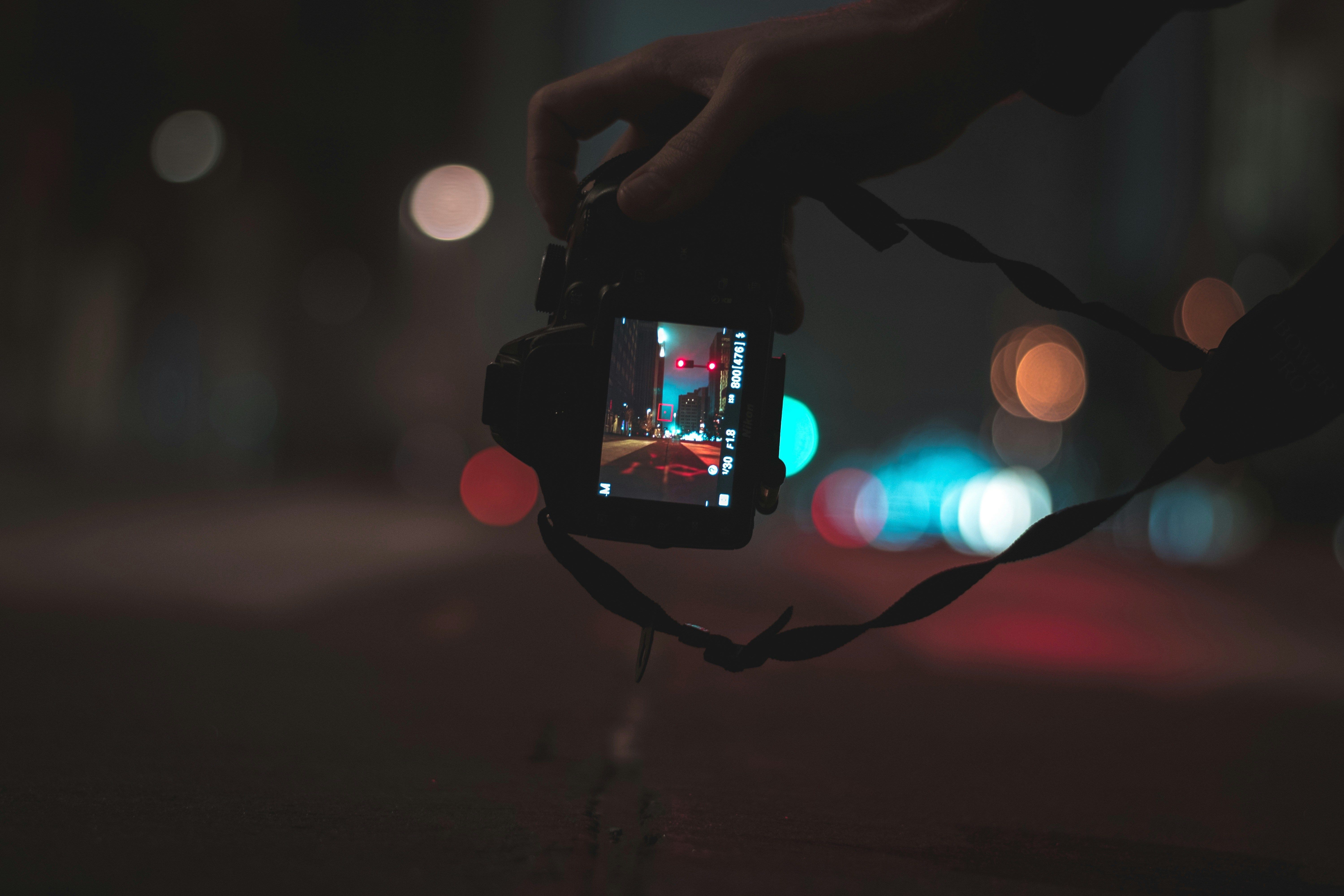
Tip 5: Work with Natural Light When Possible
Understanding how to make good Instagram posts particularly requires mastering lighting. Ambient illumination provides gentle shadows and rich colors. Indoors, position your subject near a window or use a diffused light source to maintain even exposure. Be cautious about highlights and shadows. Keep details visible in bright and dark areas.
Tip 6: Add Depth
Enhance the contrast between your subject and background to subtly direct attention. A light gradient or vignette overlay can help darken the edges just enough to make your subject pop. Keep it light enough to ensure the viewers do not notice the effect, only the subject.
Color
Tip 7: Stick to a Consistent Palette
Revolve the trendiest Instagram post ideas around your signature color palette to preserve your individual style even when you seek inspiration elsewhere. Two base hues and one accent are usually enough to keep your posts recognizable.
Tip 8: Adjust Colors with Intention
Prioritize natural skin tones first, and push color into accessories, props, or backgrounds instead. In post-processing, prioritize localized HSL adjustments over general saturation boost for bold yet realistic looks.
Tip 9: Build Consistency Inside Carousels
Keep the first slide the boldest color statement. Dial back saturation on slides two and three. It will help your viewers read the story. When scenes clash, swap or remove a competing element and replace it with a neutral to restore balance. If a product must stand out, place it against a low-contrast surface. Echo one accent color in a small detail for visual interest.
Tip 10: Prepare Before You Shoot
Plan color on shoot day. Pack two props in your accent shade (book, mug, fabric swatch) and one neutral backdrop you can roll out anywhere. Shoot a quick test tile, compare it to your last nine posts, and adjust before you commit.
Format
Tip 11: Match the Format to Your Goal
Once you know how to enhance images, the next step is to present them properly. Different types of Instagram content serve different goals and require different approaches. You can use carousels to teach something simple (step-by-step, checklist, before→after), turn a Reel into a matching cover + summary slide, and mix one “pattern breaker” tile per row (quote card, texture, or minimal flat lay) to reset the eye.
Tip 12: Be Consistent, but Not Predictable
Design a weekly rhythm so variety never breaks cohesion. Develop a recognizable visual pattern, but don’t forget to break it intentionally once per row to spark visual interest.
Tip 13: Design with Intent
Keep text overlays under six words, use 4:5 crops for feed impact, and preview the nine-tile view before publishing. For quick production, keep two reusable cover layouts and one caption template. It will let you deliver your content consistently, even when you are tired or busy.
Tip 14: Tie Each Format to a Clear Action
Tutorials aim for saves, comparisons aim for comments ("A or B?"), and starter kits (gear lists, ingredient rundowns, pose prompts) drive shares. Track saves + profile visits as your primary signals; keep the two best-performing formats each month and retire one that lags so your content strategy stays lean and effective.
If you have a small business idea, these tips will come in handy.
Conclusion
Eye-catching posts come from clear decisions, not heavy effects. Small, repeatable steps make production faster, your grid more consistent, and your posts easier to recognize. Use the tips from this guide to make your audience stop scrolling and lean in.