
Contents
Table of Contents
How to Edit Your Photos to Enhance Golden Hour Glow
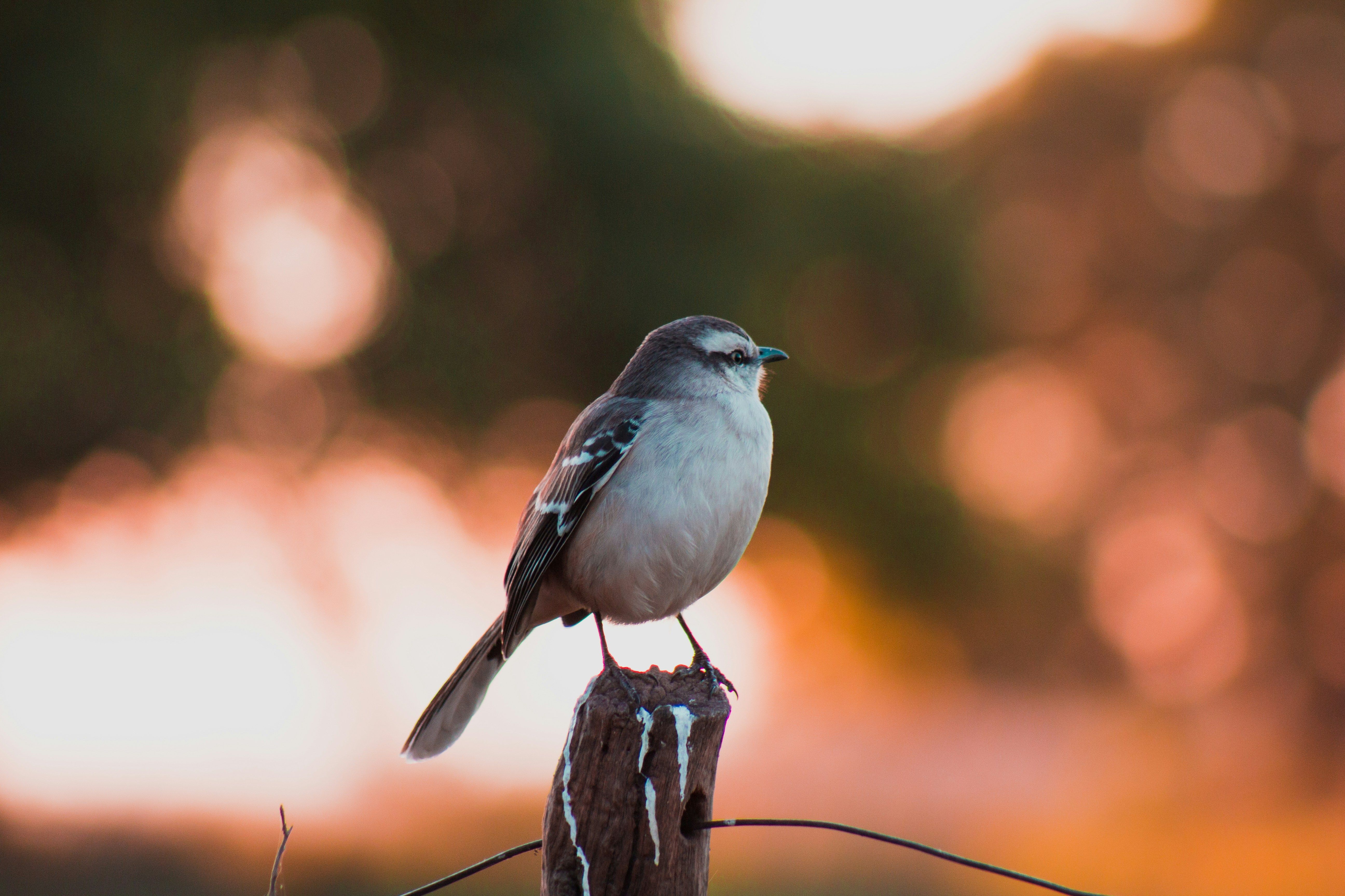
What is the golden hour? It is the short time just after sunrise or before sunset. Photographers love this time period because of the soft, warm light and gentle long shadows that can enhance pictures in every style and genre, from architecture shots to Instagram selfies.
The camera often records the golden hour scene flatter than your eyes remember—highlights clip, shadows lose detail, and colors can drift. With a simple, intentional workflow, you can restore depth, guide the eye toward the light source, and keep skin tones natural while the background breathes with warmth.
In this article, we explain how to edit golden hour photos. You will learn to warm white balance with restraint, shape light locally to reinforce direction, and fine-tune color so the story feels true to memory.
Step 1: Lighting and Color Adjustments
Start your golden hour edit by lowering the exposure to highlight details in the sky. Then cautiously lift the shadows without flattening the contrast. The histogram tool in your photo editor will be particularly helpful here, but avoid clipping on either side. Add a touch of midtone contrast using curves or a modest contrast boost to restore depth. In portraits, place a temporary radial mask over the subject and check that the skin holds.
To represent the golden hour colors realistically, set the “Daylight” white balance. Nudge the temperature to the warmer side and add a slight magenta tint until the whites look neutral. Confirm that your light direction and scene color match the time of day you are emulating. Use the preview function regularly to prevent color drifts.
HSL can also help you shape the golden hour effect. In HSL/Color Mixer, slide Yellow a touch toward Orange, lift Orange Luminance for luminous skin, and pull Blue Luminance down slightly to deepen the sky.
Keep your warm tones near classic gold tones. You can use the HEX code for gold as a soft reference. Use a soft radial mask from the sun’s direction—the “sun pocket”—to add a hint of warmth. Then, feather generously so the glow breathes. Counterbalance is achieved by subtly darkening frame edges with a linear gradient to keep attention on the light path. If halos appear, reduce mask contrast, widen feathering, and back off global saturation.
Step 2: Detail Refinement
Edges and colors should line up before you add crispness. Address issues like distortions, vignetting, and chromatic aberration. Then, remove digital noise. It is important to do this before sharpening because denoising tools can accidentally soften the details you want to emphasize.
Mask sharpening to edges so blank areas (sky, skin, gradients) stay smooth. As a rule of thumb, use a small radius for high-resolution sensors (around 0.6–1.0 px) and a moderate amount. Add some micro-contrast to specific textures like foliage veins, rock grain, fabric weave, and city facades. It can make images deeper and more evocative. However, do not apply this function to faces or skies because it makes your pictures look artificial and ruins the appeal.
For portraits, create a subject mask and dial back clarity/texture a notch on skin while keeping eyes, lashes, lips, and hair crisp. If warm light exaggerates redness, you should lower saturation in the red/orange ranges just on the face, or nudge tint locally toward green by a hair. Retouch small distractions (stray hairs, sensor spots, tiny signposts) with a heal tool at a subtle opacity.
Subtle dodging and burning can give you a polished finish. Lift midtones where light naturally falls (cheekbones, shoulders, ridge lines) and darken minor clutter at the frame’s edges. Prioritize a low flow, big soft brush, and multiple passes. Learn to trust your own perception of light instead of relying too heavily on sliders.
Step 3: Final Touches and Exporting
Do a cohesion pass before you ship. Flip between this frame and the rest of the set and match warmth, contrast, and brightness so the gallery feels consistent. If one image drifts too orange or too cool, correct it here rather than reworking the whole edit.
Look at your composition and readjust it if necessary. Level the horizon, trim dead space, and align leading lines toward the light source.
Prepare platform-specific exports:
- Web/Sharing: sRGB, long edge ~2048–3000 px, JPEG quality ~80–85%, moderate output sharpening for screen.
- Portfolio/Client Preview: 3000–4500 px long edge, subtle watermark if needed, include metadata.
- Print: 300 dpi, TIFF or high-quality JPEG, output sharpening for print; embed the correct profile.
Also, lately, you can use an AI image generator to help you with many aspects.
Name files clearly (date_location_subject_variant) and keep a master export preset to stay consistent across projects. Ensure your main subject remains the focal point even on the smallest screens with various brightness settings.
Conclusion
Golden hour has a way of making ordinary scenes feel personal. What matters most is the story your image tells. If the skin looks true, the sky breathes, and the eye naturally follows the light, you have done the job well. Keep noticing how small choices change the mood, trust subtlety, and let the sun's character lead.